| Rank | Definitive ID | Hospital name | State | # of CHF patients | Explore dataset |
|---|---|---|---|---|---|
| 1 | 541974 | NewYork-Presbyterian Weill Cornell Medical Center | NY | 6,399 | Explore |
| 2 | 873 | AdventHealth Orlando (FKA Florida Hospital Orlando) | FL | 6,300 | Explore |
| 3 | 2843 | Tisch Hospital | NY | 5,507 | Explore |
| 4 | 430 | Cedars-Sinai Medical Center | CA | 4,035 | Explore |
| 5 | 3525 | Lehigh Valley Hospital - Cedar Crest | PA | 4,006 | Explore |
| 6 | 2191 | Mayo Clinic Hospital - Saint Marys Campus | MN | 3,905 | Explore |
| 7 | 1973 | Massachusetts General Hospital | MA | 3,775 | Explore |
| 8 | 3862 | Methodist Hospital | TX | 3,743 | Explore |
| 9 | 920 | Sarasota Memorial Hospital | FL | 3,249 | Explore |
| 10 | 2687 | Morristown Medical Center | NJ | 3,243 | Explore |
| 11 | 1154 | Evanston Hospital (AKA NorthShore Evanston Hospital) | IL | 3,189 | Explore |
| 12 | 744 | Christiana Hospital | DE | 3,172 | Explore |
| 13 | 4271 | Inova Fairfax Hospital (AKA Inova Fairfax Medical Campus) | VA | 3,131 | Explore |
| 14 | 2830 | St Francis Hospital & Heart Center (AKA St Francis Hospital - The Heart Center) | NY | 3,071 | Explore |
| 15 | 3120 | Cleveland Clinic Main Campus | OH | 3,041 | Explore |
| 16 | 576749 | Baptist Medical Center Jacksonville (FKA BMC Downtown) | FL | 2,808 | Explore |
| 17 | 274147 | Memorial Hermann Southwest Hospital | TX | 2,778 | Explore |
| 18 | 1678 | Norton Hospital | KY | 2,778 | Explore |
| 19 | 1940 | Baystate Medical Center | MA | 2,757 | Explore |
| 20 | 731 | Yale New Haven Hospital | CT | 2,740 | Explore |
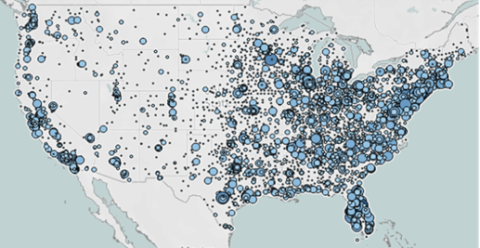
Fig 2. Analysis of CHF patient volume data from the DHC Visuals Hospital Therapy Area Analytics dashboard for the 2023 claims year. Data is sourced from the CMS Medicare SAF.
From the data, New York-Presbyterian Weill Cornell Medical Center had the highest volume of CHF patients across the U.S. in 2023. Identifying these high-volume hospitals allows users to map their target territories and form a strong lead base before executing a sales strategy.
2. Trace referral patterns and identify network leakage
Tracing referral patterns is an easy way to highlight relationships between hospitals and other local healthcare providers like long-term care centers or, in this case, rehabilitation facilities. Users can leverage this information to learn about how specific facilities refer their patients and where they may be receiving other patient referrals from.
On the DHC Visuals dashboard, outbound referrals are represented by either a blue or orange line—denoting either in-network or out-of-network referral—connecting the originating hospital to the destination facility. The strength of the line illustrates the number of outbound referrals, with bolder lines representing the highest referral volumes.
2023 New York-Presbyterian Weill Cornell Medical Center outbound CHF referrals
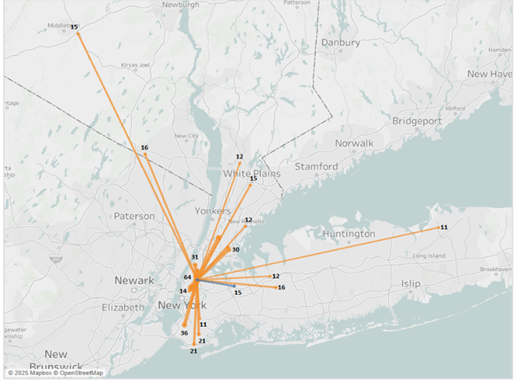
Fig 3. Outbound referrals featured on the DHC Visuals Hospital Therapy Area Analytics dashboard for congestive heart failure. Medical claims data sourced from CMS Medicare SAF for the year 2023.
This dashboard shows CHF outbound referrals from New York-Presbyterian Weill Cornell Medical Center. The data highlights where patients are referred to when they require care outside the originating hospital, including whether those referrals stay in-network or go out-of-network.
The data reveals that the hospital is experiencing significant out-of-network referral leakage for congestive heart failure patients, with nearly all referrals going to external hospitals rather than staying within the network. Tisch Hospital receives the highest volume of referrals (64), followed by Montefiore Hospital’s Moses Campus (44), Maimonides Medical Center (36), and Mount Sinai Hospital (34), indicating that these facilities are capturing a substantial share of patients.
While most referrals remain within the New York City area, there is a noticeable regional spread into Westchester County, Long Island, and even northern New Jersey, suggesting that patient movement extends beyond the immediate local market.
Altogether, these findings highlight a major opportunity for New York-Presbyterian to reduce referral leakage by expanding in-network service offerings, strengthening relationships with cardiologists and referring providers, and improving patient navigation programs.
What does this mean for you? Identifying network leakage can be a strategic way to cater your sales approach to fit the specific pain points of a given hospital or facility.
3. Discover new patient and provider insights
Using data visualization technology, stakeholders can access advanced healthcare intelligence in a snap. Tools like the Atlas All-Payor Claims dataset unify hospital, physician, and medical claims data to deliver comprehensive industry insights.
The Definitive Healthcare platform puts your patient cohort data into an actionable context. With this tool, you can build customized patient cohorts to discover a hyper-targeted set of providers with the greatest number of treatment-ready patients.
Our platform not only helps you identify your total addressable market by region but also helps you discover patterns in shared patient comorbidities, physician referrals, prescription use, and treatment histories—giving you the insight to turn data into action.
Learn more
Interested in learning more about how you can leverage data analytics to shape your next sales strategy? We’re here to help. Start a free trial today and discover intelligence from Definitive Healthcare can help you understand the patients, providers, facilities, and technologies that define the healthcare landscape.